
Krushr or ClickUp? Choose a working surface, not a feature trophy.

Krushr: simultaneous context on one canvas
ClickUp: deep suite breadth and hierarchy
Choose visual focus or platform depth
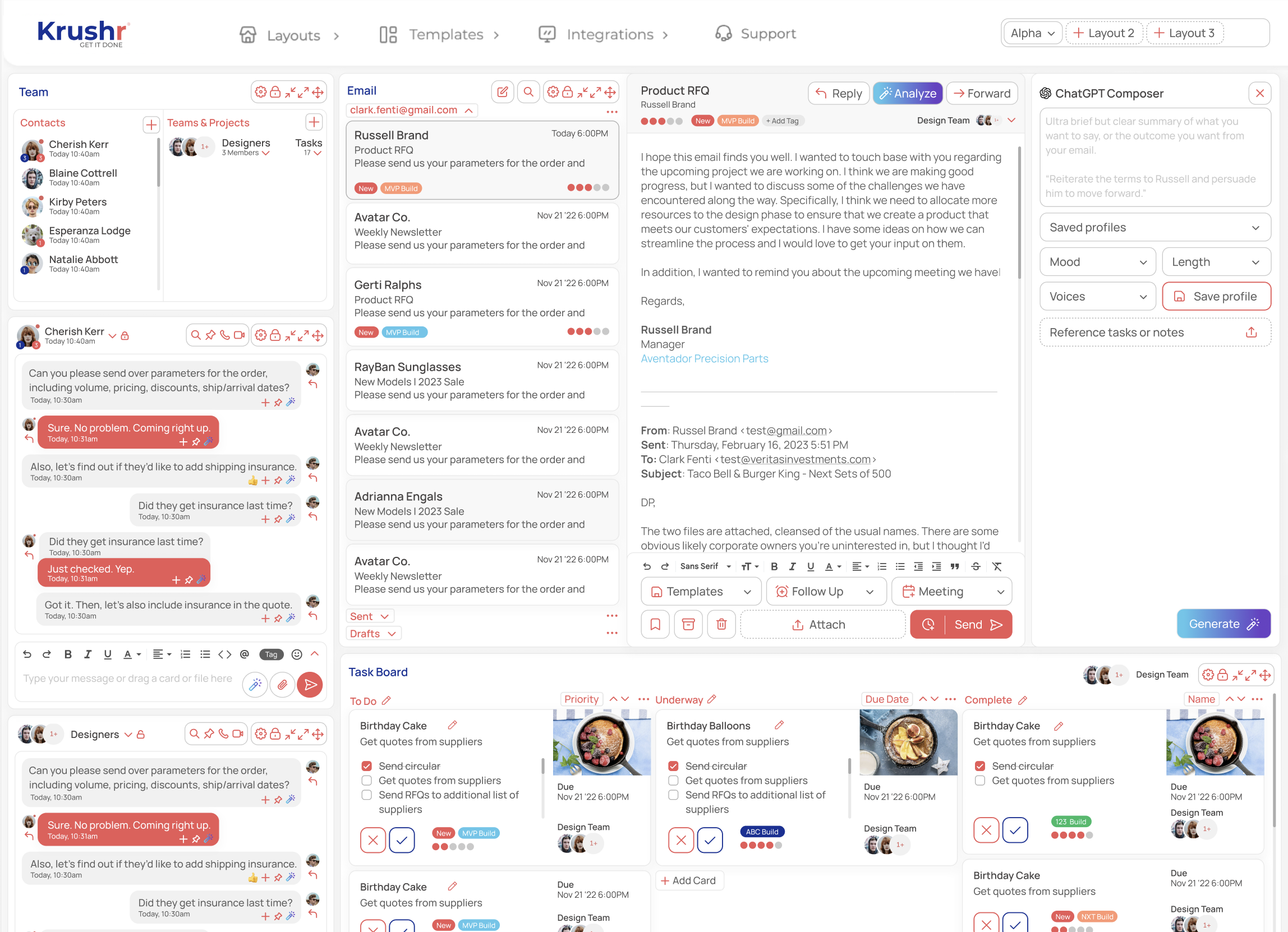
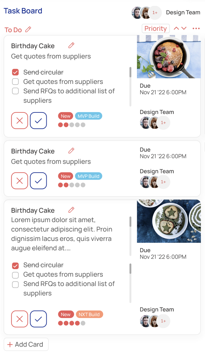
What is the main difference between Krushr and ClickUp?
Krushr is organized around one composable project screen. ClickUp is organized around a broad work hierarchy with many view types and management capabilities. The better fit depends on whether the team values simultaneous context or suite depth more.
Source checked July 14, 2026: ClickUp official feature page.
Choose Krushr for a composed, all-on-one-page workspace
Choose ClickUp for broad work-management depth
Check ClickUp's current offer at clickup.com/features before deciding
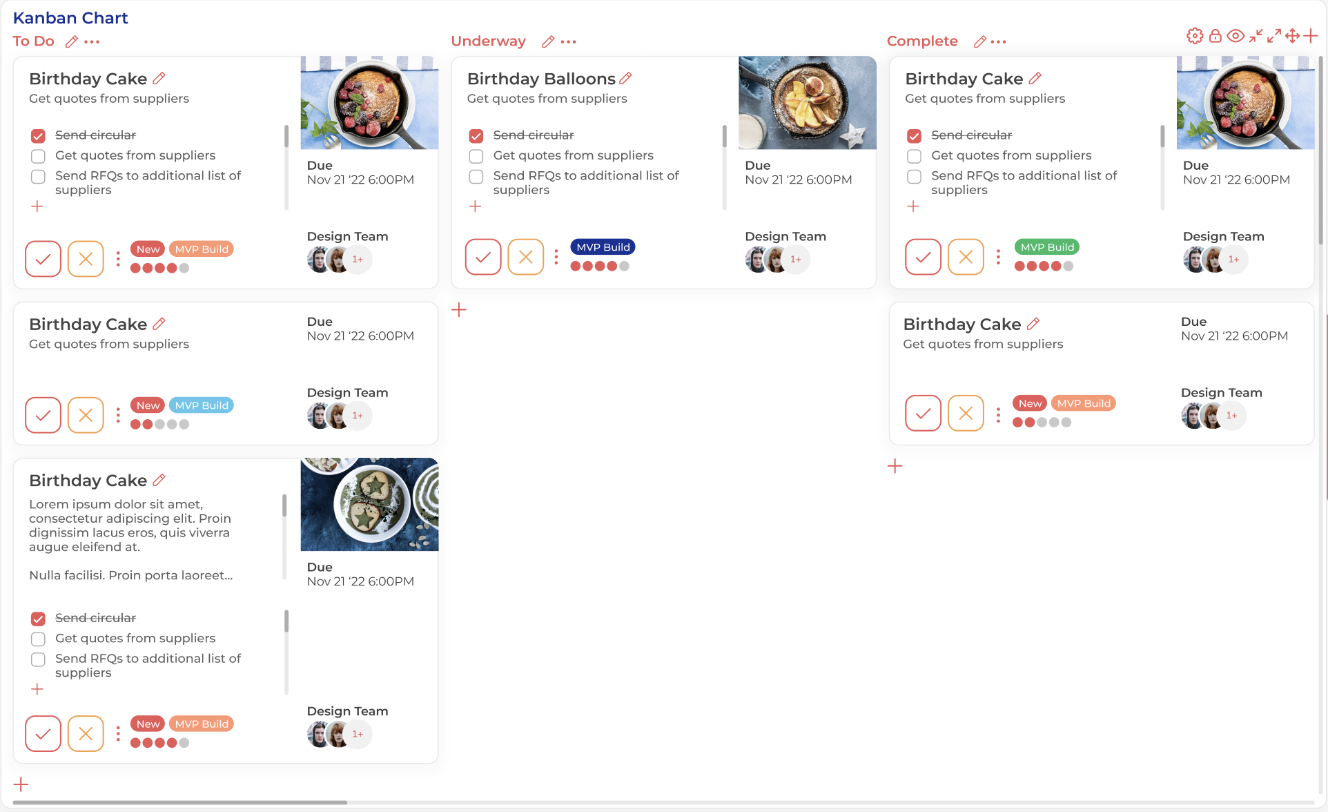
Less switching or more platform depth.
Krushr fits teams that want communication, tasks, dates, notes, meetings, and files visible together. ClickUp fits organizations that need a mature hierarchy, extensive reporting, automations, knowledge tools, time and resource features, and a large integration surface.
Straight answers
Is Krushr trying to match every ClickUp feature?
No. Krushr's focus is the simultaneous panel workspace.
Which is better for complex reporting and hierarchy?
ClickUp is the stronger fit when those broad suite capabilities are required.
Which is better for keeping communication beside active work?
Krushr is designed around that exact visual workflow.